Exploring Paper Sizing: How Absorbency Shapes Colour
Sizing matters more than you might think
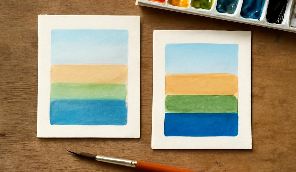
Paper sizing—whether applied within the pulp or on the surface—controls how water and pigment interact with a support. A highly sized sheet keeps washes on the surface longer, allowing for soft edges and glazing, while an unsized or lightly sized sheet lets pigment penetrate quickly, producing grainy edges and muted saturation. Understanding this can save time and help you choose the right paper for a desired effect.
Simple absorbency tests
Run a few quick tests on suspect sheets before committing a larger piece. All you need are small swatches of the papers you want to compare and common pigments you use often.
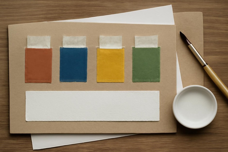
- Cut three matching squares from each paper you own and label them.
- Drop a standard puddle of water on each and time how long it holds as a surface puddle. Long puddles indicate stronger sizing.
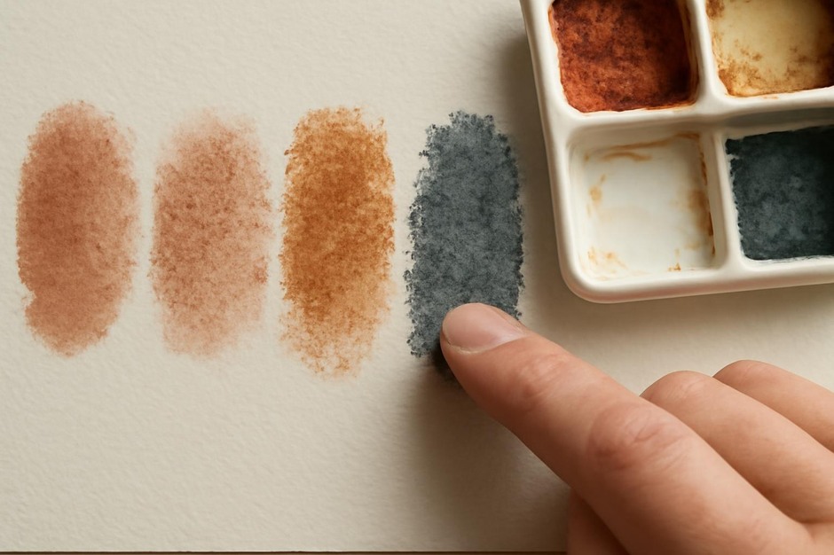
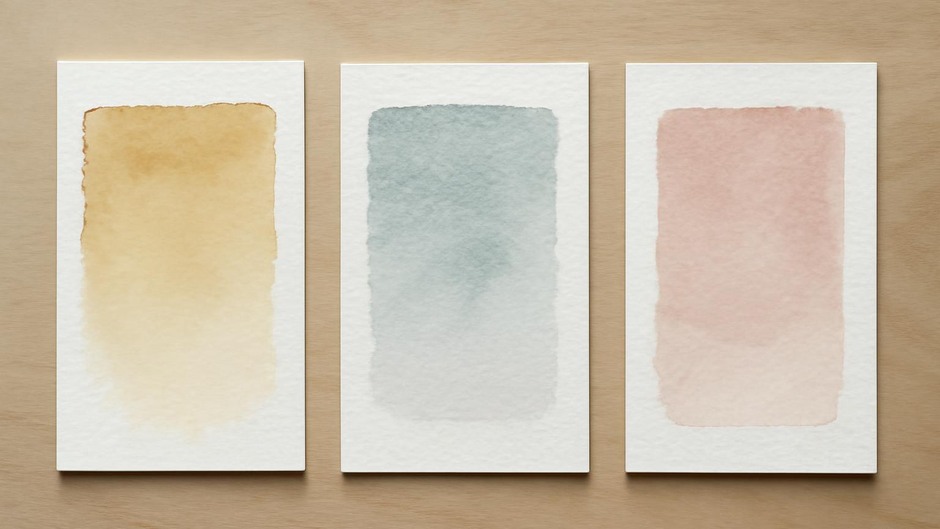
- Apply a single wash of a vivid pigment at a consistent dilution and note the edge clarity and colour intensity after drying.
- Try lifting: brush a wet clean brush over the dried wash to see how much pigment comes up; sized papers often allow cleaner lifting.
Interpreting test outcomes
If your wash looks bright with clear edges and the paper allows precise detail, the sizing is holding the pigment at the surface. If the wash looks muted or the edges feather into the paper texture, the sheet is more absorbent. Neither is inherently superior; choose based on technique. For wet-on-wet effects and soft washes, a more absorbent sheet can be friendly. For glazing, fine detail, and crisp edges, a well-sized paper is usually preferable.
Surface textures and sizing interactions
Rough and cold-pressed textures add another variable. Coarser surfaces increase perceived absorbency because the pigment settles in valleys of the paper. When testing, consider both texture and sizing together: a strongly sized rough sheet may still behave differently than a lightly sized hot-pressed sheet.
Practical experiments to try
- Repeated glazing: apply multiple thin glazes on different sheets to see how colour builds and whether previous layers lift.
- Drybrush on edge: test how textured papers accept drybrush marks on sized versus unsized areas.
- Blotting and correction: make a deliberate mistake and use blotting and lifting to correct it; some supports handle correction more cleanly.
Documenting and deciding
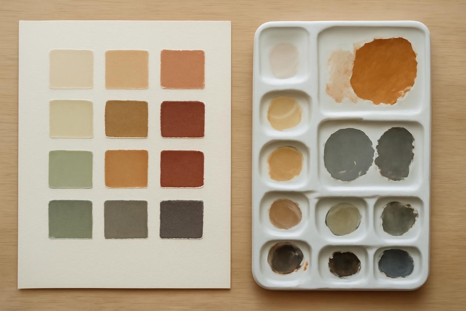
Keep a simple notebook with photos and short notes for each paper type and the pigments you use most. Over a few months you will build a practical reference for which sheets match particular techniques. This habit of testing and recording reduces surprises and helps you tailor paper choice to the visual effect you are aiming for.
Final thought
Paper sizing is an invisible part of drawing and painting that has visible consequences. Regular, small tests will sharpen your eye and your decisions. You do not need every paper: you need a few well-understood supports that reliably produce effects you want to explore.