Gouache and Watercolour: Practical Experiments in Layering
Two cousins with different habits
Gouache and watercolor share similar ingredients but behave differently. Watercolour is prized for luminous glazes and granulation; gouache offers opaque coverage and a matte finish. Running side-by-side experiments clarifies which medium suits a particular effect.
Set up for direct comparison
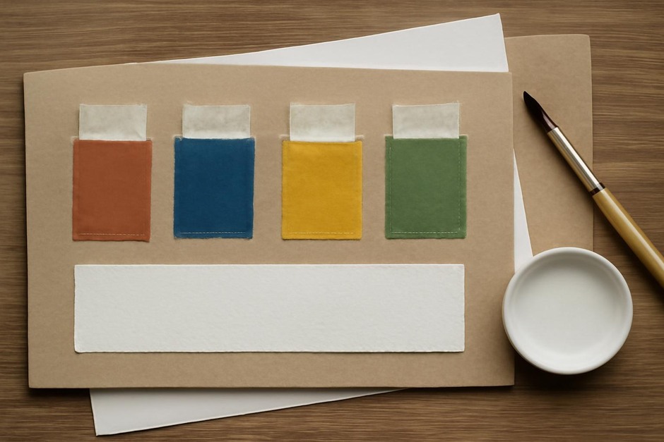
Use two matching sheets of the same paper type and texture. Prepare identical pigment mixes at comparable values so you can isolate how each medium handles layering, reworking, and texture.
Experiment 1: Transparent glazing
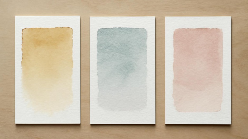
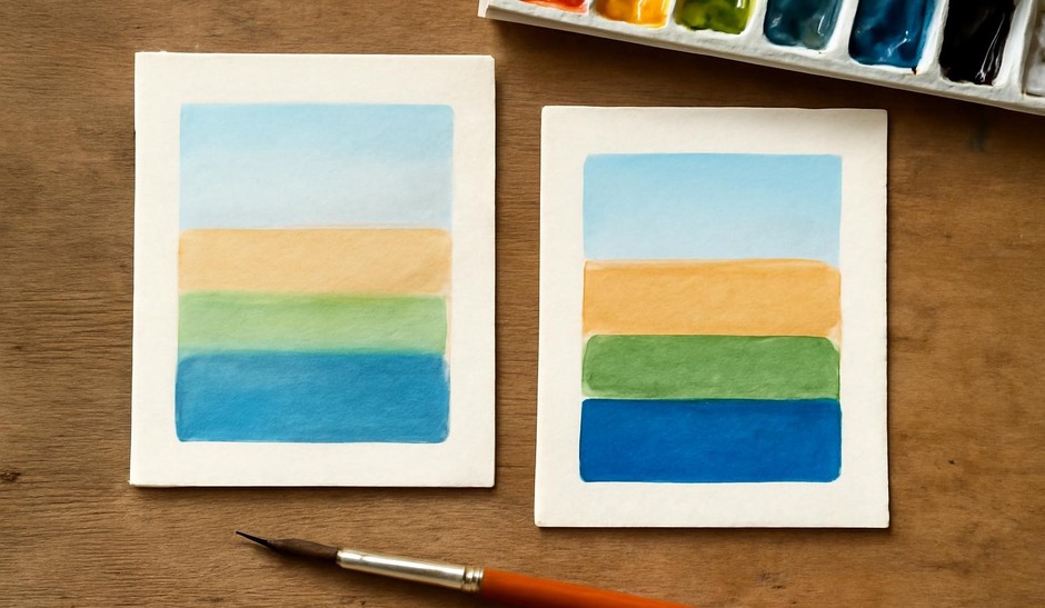
- On the watercolor sheet, apply a thin, even wash and allow it to dry. Apply a second transparent layer of the same pigment to observe colour deepening and edge behaviour.
- On the gouache sheet, dilute gouache thinly to a transparent wash and repeat the same two-layer sequence.
Observe differences. Watercolour glazes often remain luminous because the pigment sits in the paper fibers, while thin gouache glazes can lose some of that glow, leaning toward a satin matte finish. Use this test to decide when you want luminosity versus a cleaner, more uniform cover.
Experiment 2: Opaque corrections
- Create a mid-toned wash on both sheets and let it dry.
- Attempt to paint a lighter shape over the mid tone using both mediums in their opaque mode.
Gouache will generally cover more effectively with fewer layers. Watercolour requires careful lifting or a more restrained approach; heavy lifting can disturb the support. This experiment shows that gouache is efficient for corrections and highlights, while watercolor rewards forethought and subtle adjustments.
Experiment 3: Reworking and lifting
Test how each medium responds to rewetting. Use a clean damp brush to lift pigment from a dried area. Watercolour often lifts more readily, allowing soft corrections, while gouache may form a skin that resists lifting once dry. Knowing this helps plan whether a surface will tolerate later changes.
Texture and brushwork
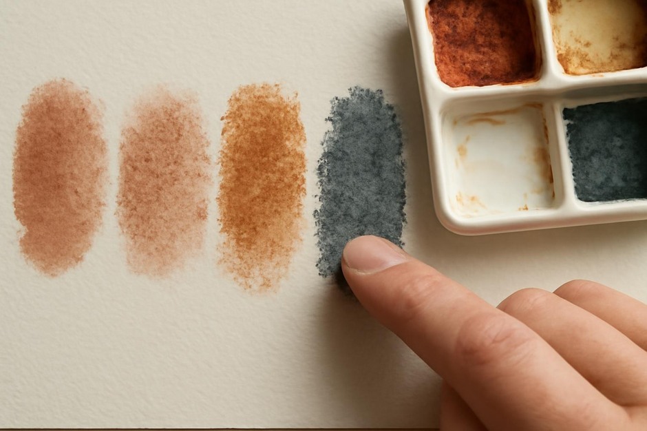
Try drybrush strokes on both surfaces. Gouache’s opacity supports crisp, graphic marks that sit above earlier layers. Watercolour’s translucency makes drybrush marks integrate more with underlying washes. These characteristics influence compositional choices: choose gouache for layered graphic passes and watercolor for gradual optical mixing.
Practical integration
Many artists combine both: begin with watercolour washes for luminous foundations, then add gouache for highlights and corrective marks. Test combinations yourself to see how much watercolour you can safely overpaint with gouache without muddiness. Start with conservative layers and build.
Documenting your observations
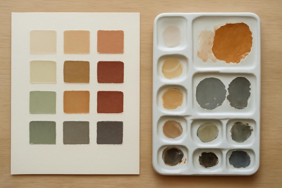
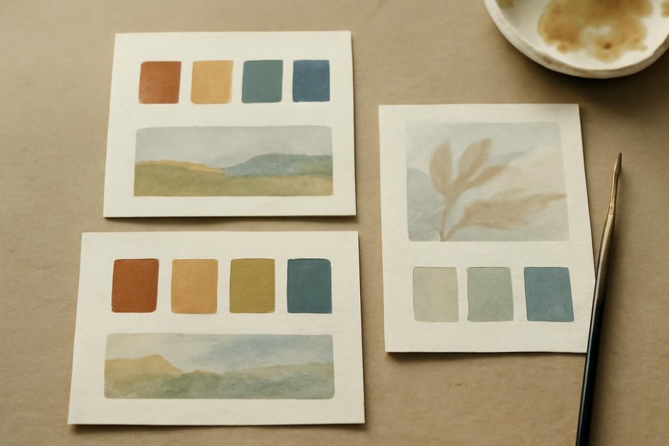
Label each sample with pigment ratios, dilution, drying time, and whether you reworked or varnished. Over time you will build a personal reference for how fast each medium dries on the papers you favor and what marks remain workable.
Summary
These experiments clarify the distinct strengths of gouache and watercolour. Use transparent washes and glazing where luminosity matters, and reserve gouache where opacity, correction, or strong graphic marks are desirable. Small, repeated tests are the fastest path to confident material choices.